Flex Container Properties

The upcoming (and awesome) gifs were graciously borrowed from this insightful blog post that covers flexbox
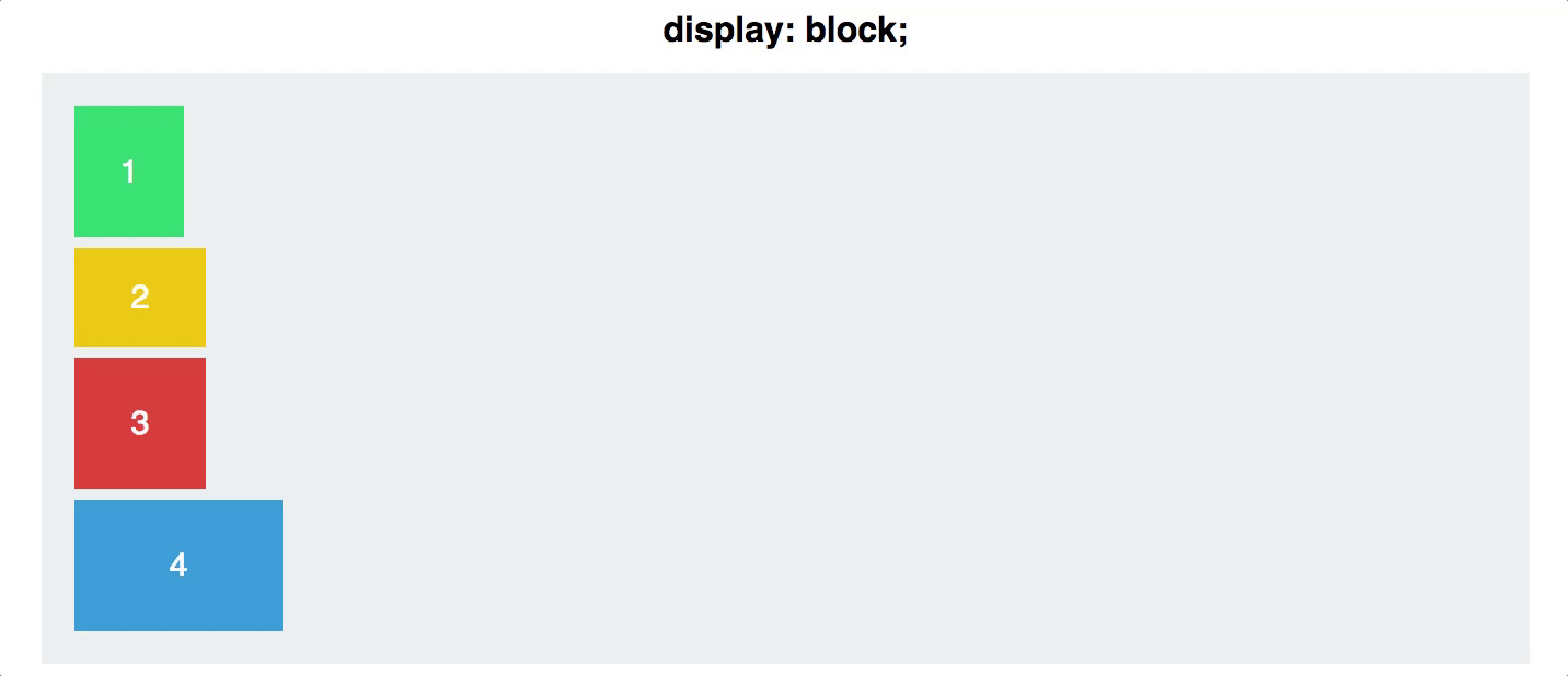
display
Defines a flex container
inline or block depending on the given value
.container {
  display: flex; /* or inline-flex */
}
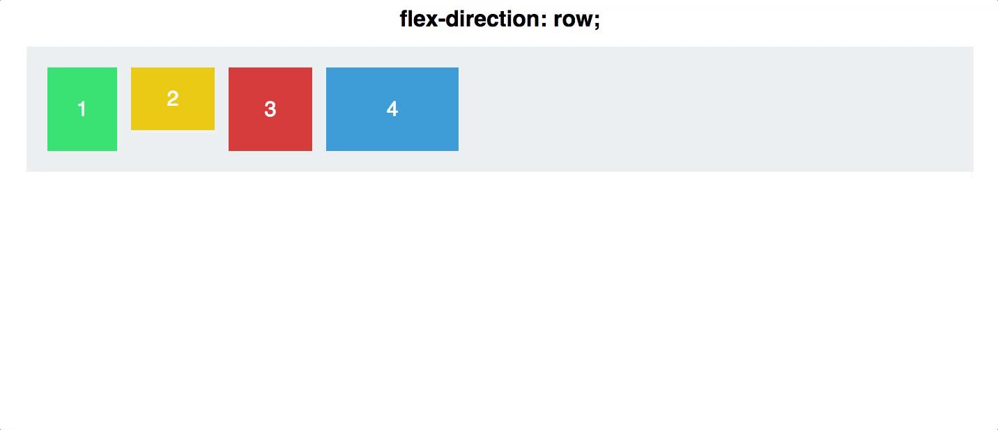
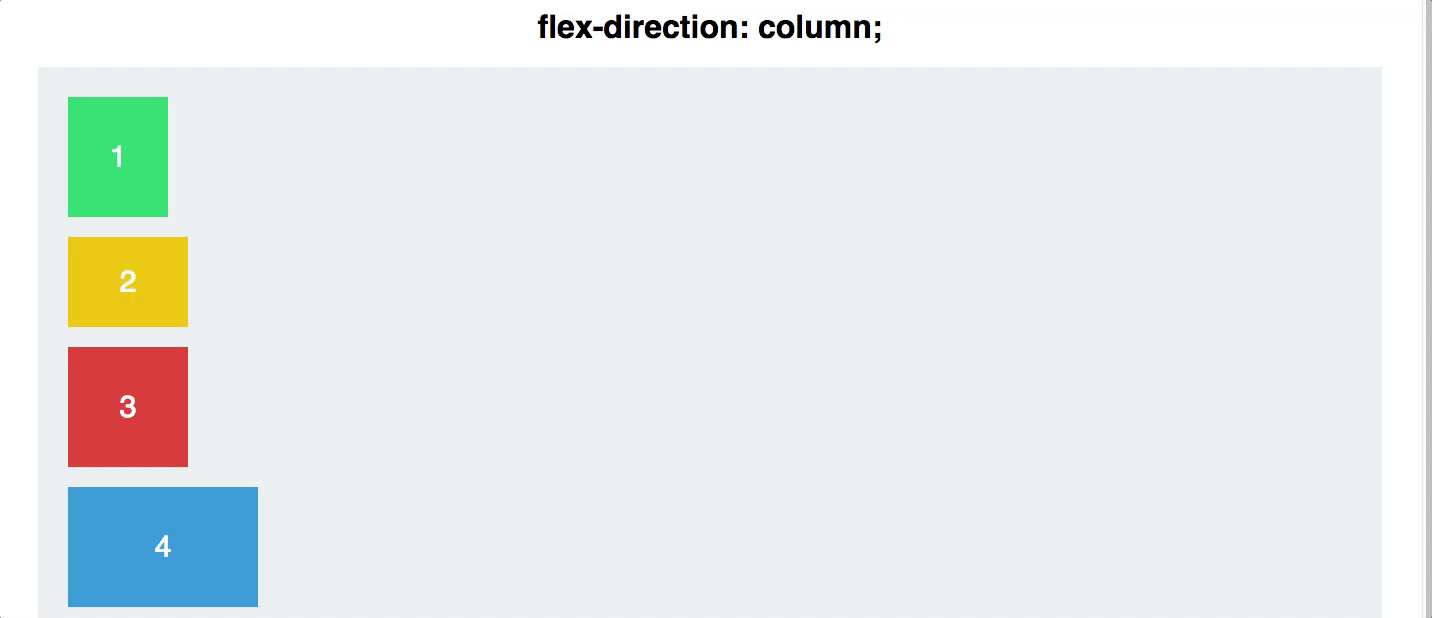
flex direction

Establishes the main-axis and defines the direction flex items are placed in the flex container
Determines whether the flex items are layed out as either horizontal rows or vertical columns
.container {
  flex-direction: row | row-reverse | column | column-reverse;
}
flex wrap

- flex-wrap allows developers to change that and allow the items to wrap as needed with this property
By default, flex items will all try to fit onto one line
.container {
  flex-wrap: nowrap | wrap | wrap-reverse;
}
Flex Flow shorthand
- Allows developers to specify the
flex-directionandflex-wrapproperties at the same time
flex-flow: <‘flex-direction’> || <‘flex-wrap’>
//specifies flow-direction: row & flex-wrap: wrap
flex-flow: row wrap
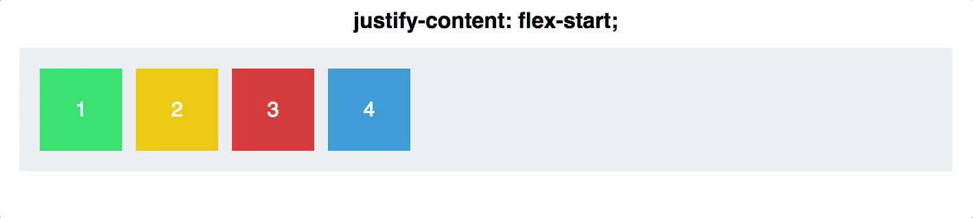
justify-content

defines the alignment along the main axis
will distribute extra free space left after all the flex items have reached their maximum size
.container {
  justify-content: flex-start | flex-end | center | space-between | space-around;
}
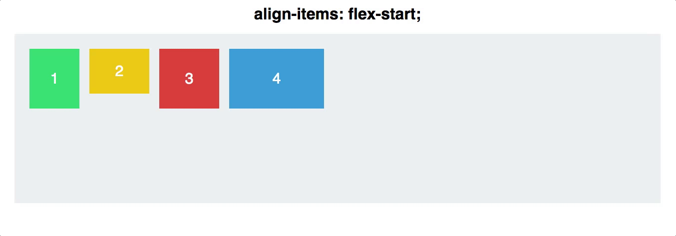
Align Items

- defines the default behaviour for how flex items are laid out along the cross axis on the current line
Align Content

aligns a flex container’s lines within when there is extra space in the cross-axis
align-content only applies when there are mutiple lines of flex items
.container {
  align-content: flex-start | flex-end | center | space-between | space-around | stretch;
}