Last Class Review
Flexbox Terminology
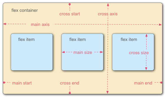
Flex Container
The parent element in which flex items are contained
Defined using the
flexorinline-flexvalues of the display propertyflex: will make the flex-container a block-level elementinline-flex: will make the flex-container an inline element
Flex Item
- Children of a flex container
Main Axis
The axis along which the flex items follow each other
flex-directionproperty determines the main axis
Cross Axis
- The axis perpendicular to the main axis
Main Axis and Cross Axis changes with Flex Direction
If the flex-direction is
roworrow-reversethen the main axis will be along the horizontal plane and the cross axis will be along the vertical planeIf the flex-direction is
columnorcolumn-reversethen the main axis will be along the vertical plane and the cross axis will be along the horizontal plane
Flex Container Properties

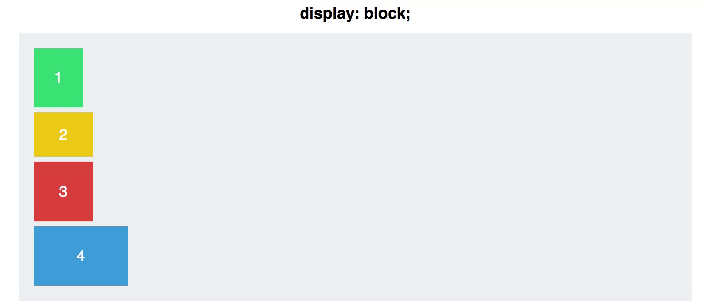
display
Defines a flex container
inline or block depending on the given value
.container {
  display: flex; /* or inline-flex */
}
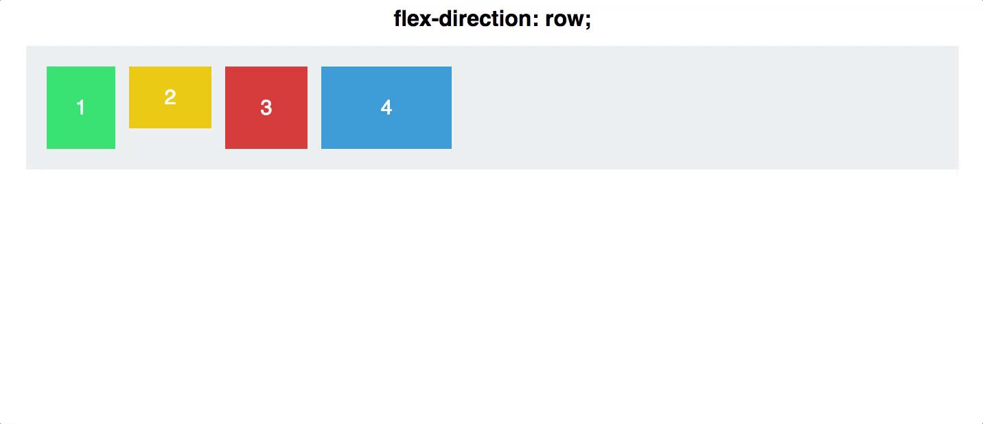
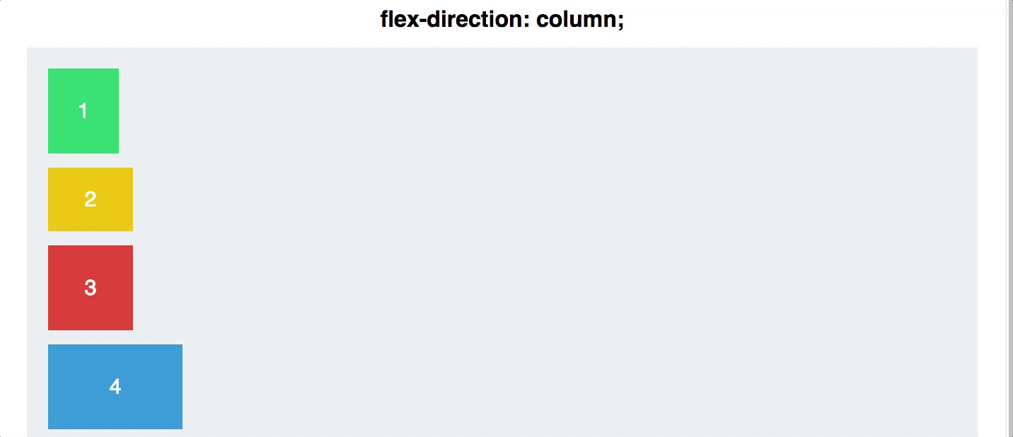
flex direction

Establishes the main-axis and defines the direction flex items are placed in the flex container
Determines whether the flex items are layed out as either horizontal rows or vertical columns
.container {
  flex-direction: row | row-reverse | column | column-reverse;
}
flex wrap

- flex-wrap allows developers to change that and allow the items to wrap as needed with this property
By default, flex items will all try to fit onto one line
.container {
  flex-wrap: nowrap | wrap | wrap-reverse;
}
Flex Flow shorthand
- Allows developers to specify the
flex-directionandflex-wrapproperties at the same time
flex-flow: <‘flex-direction’> || <‘flex-wrap’>
//specifies flow-direction: row & flex-wrap: wrap
flex-flow: row wrap
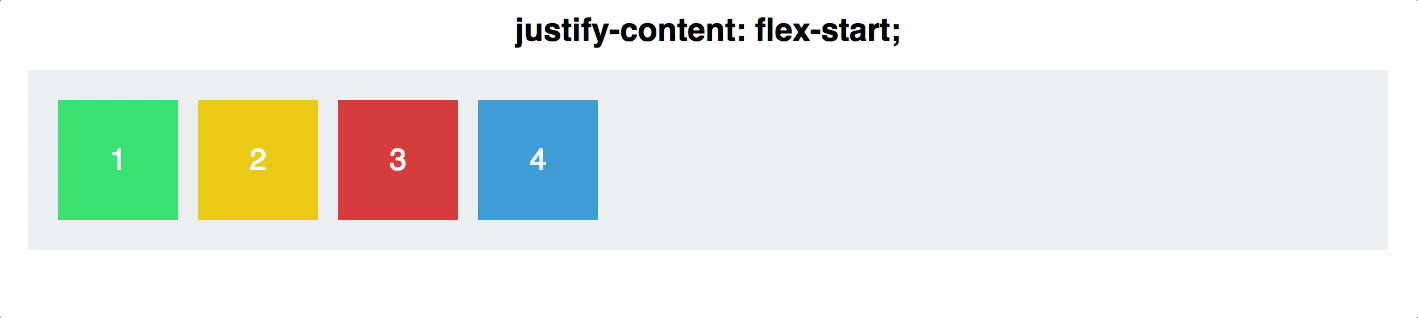
justify-content

defines the alignment along the main axis
will distribute extra free space left after all the flex items have reached their maximum size
.container {
  justify-content: flex-start | flex-end | center | space-between | space-around;
}
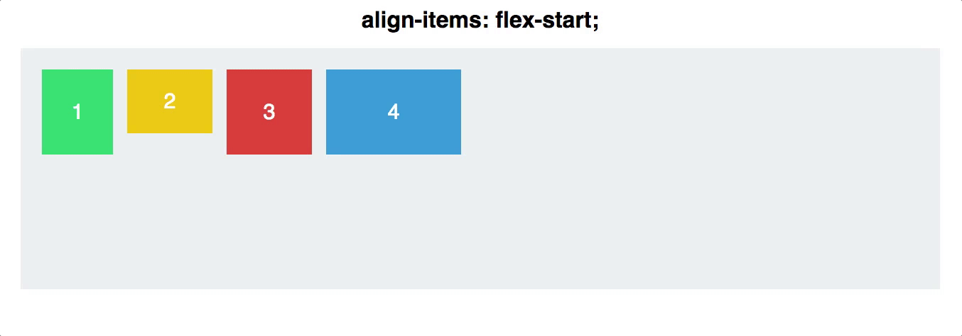
Align Items

- defines the default behaviour for how flex items are laid out along the cross axis on the current line
Align Content

aligns a flex container’s lines within when there is extra space in the cross-axis
align-content only applies when there are mutiple lines of flex items
.container {
  align-content: flex-start | flex-end | center | space-between | space-around | stretch;
}
Flex Items Properties

align-self

- allows the default alignment (or the one specified by align-items) to be overridden for individual flex items.
.item {
  align-self: auto | flex-start | flex-end | center | baseline | stretch;
}
Order

- controls the order in which flex-items appear in the flex container
.item {
  order: <integer>;
}
flex-grow
defines the ability for a flex item to grow if necessary
dictates what amount of the available space inside the flex container the item should take up
a unitless measure that respresents a proportion or ratio
flex-grow value overrides the width of the flex-item
.item {
  flex-grow: <number>; /* default 0 */
}
In the example above, the 2nd flex-item (green box) has its flex-grow set to 2 while the other flex-items have their flex-grow set to 1
flex-shrink
defines the ability for a flex item to shrink if necessary.
a unitless measure that respresents a proportion or ratio (similar to flex-grow)
flex-basis
Controls the default size of an element, before it is manipulated by other Flexbox properties
It can be a length (e.g. pixels, percentages, etc) or auto
- auto
.item {
  flex-basis: <length> | auto; /* default auto */
}
flex shorthand
- allows developers to specify a flex-item’s
flex-grow,flex-shrinkandflex-basisall at the same time
.item {
  flex: none | [ <'flex-grow'> <'flex-shrink'>? || <'flex-basis'> ]
}