Media Query Parts
@media only screen and (min-width: 480px) {
  /** add styles here **/
}
@media
- All media queries must start with @media
Media Type
Indicates what type of media the query will be using. Screen tells the browser the query will be used by a computer or mobile device
The only keyword indicates that this query will be only be for the screen media type and no other
While we will just be using the screen media type, you can see a list of all available media types here
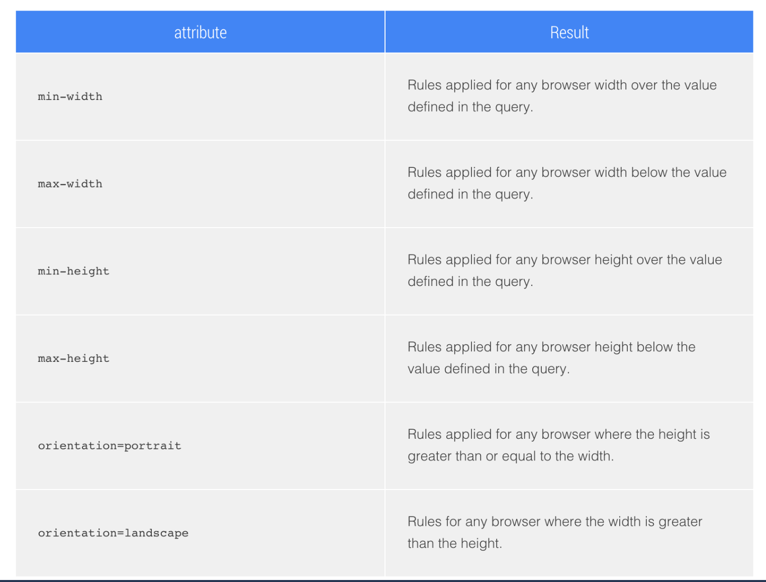
Media Feature/Attribute
Media features allows you to specify different viewport attributes and are always expressed in parentheses
Example: Will apply all styles within it’s body if the width of the viewport is greater than or equal to 240px