Grids
What are grids?
layout technique that allows for content to be stacked both vertically and horizontally in a consistent and easily manageable fashion
grid systems code is project-agnostic giving it a high degree of portability so that it may be adopted on new projects
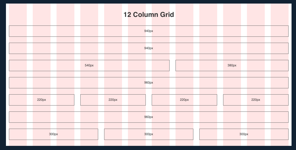
The above example is a grid system called Grid 960
Benefits of grids?
Increases productivity by providing simple and predictable layout scaffolding to HTML design
Versatile in how layouts can be constructed, being adaptable in varying combinations of rows and columns
Supports complex use cases such as nested grids
Ideal for responsive layouts; make it easy to create mobile friendly interfaces that are adaptable to different sized viewports
Where can you find grids?
Use an existing grid system such as bootstrap’s grid or zurb’s grid
- Or check out this list of the many others out there
Or we can create our own (which is what we are going to do!)
Once you understand how grids work by creating your own, you’ll be able to better evaluate the plethora of options available to you