Bootstrap Grid
Overview of Bootstrap’s Grid
Bootstrap offers developers a mobile-first grid with 12 columns
Float-based grid (the next version of bootstrap will use a flex-based grid)
Built-in classes are used to control the widths of boxes within a bootstrap grid
Containers
Bootstrap requires a containing element to house its grid system
To create a containing element add a class of
containerorcontainer-fluidto a parent container
<!-- create a bootstrap container -->

<div class="container">
  <!-- add content here -->
</div>
.container
- responsive fixed-width container centered in the middle the viewport
The following is a snippet of css taken directly from bootstrap:
.container {
  padding-right: 15px;
  padding-left: 15px;
  margin-right: auto;
  margin-left: auto;
}

@media (min-width: 768px) {
  .container {
    width: 750px;
  }
}
@media (min-width: 992px) {
  .container {
    width: 970px;
  }
}
@media (min-width: 1200px) {
  .container {
    width: 1170px;
  }
}
Click on the “JS Bin” button to a get a better view of the layout
.container-fluid
- responsive full-width container that spans the entire viewport width
Click on the “JS Bin” button to a get a better view of the layout
Grid System
Bootstrap grids are made up of rows and columns
Each row consists of 12 columns
Pre-defined classes are used to control the width of columns using
class='col-[size]-[# of columns]'
<!-- A bootstrap grid with 2 rows -->
<!-- 1st row has 2 columns (each column is 6 columns wide) -->
<!-- 2nd row has 4 columns (each column is 3 columns wide) -->


<div class="container">
  <div class="row">
    <div class="col-md-6">
      ...
    </div>

    <div class="col-md-6">
      ...
    </div>
  </div>

  <div class="row">
    <div class="col-md-3">
      ...
    </div>

    <div class="col-md-3">
      ...
    </div>

    <div class="col-md-3">
      ...
    </div>

    <div class="col-md-3">
      ...
    </div>
  </div>
</div>
Grid Options
Developers can use pre-defined classes to control the width (i.e. responsiveness) of columns depending on the viewport width
For example, adding a class of
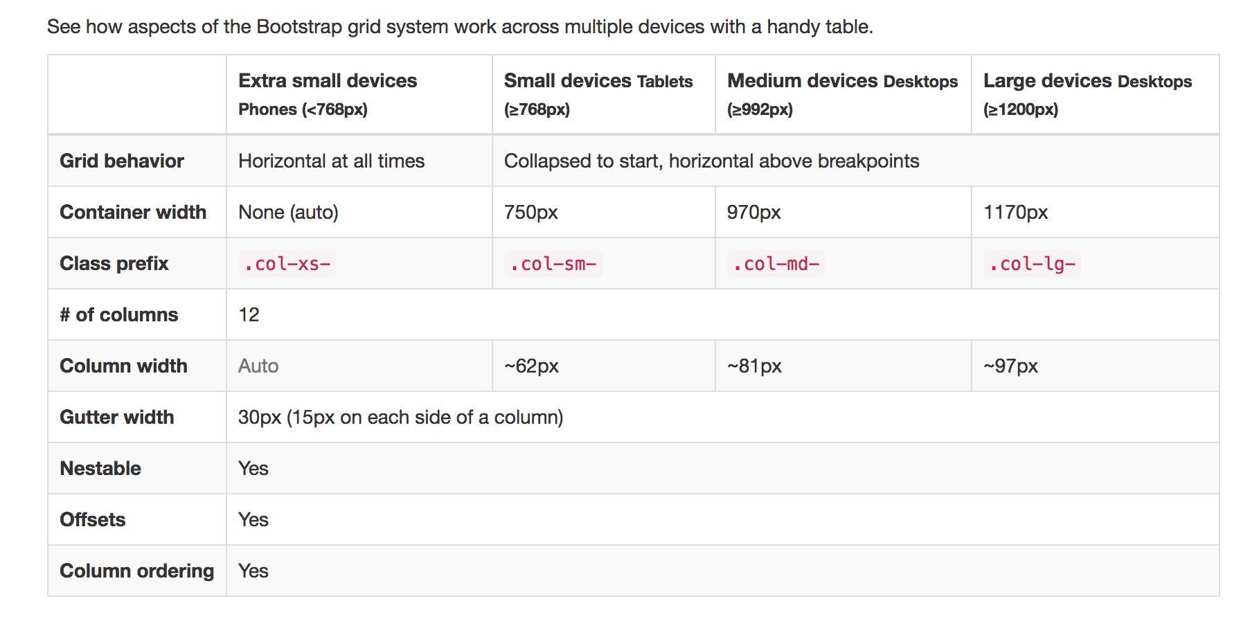
col-xs-6to a column will result in the column taking up 50% of the container width (6 columns / 12 columns) when the viewport width is less than 768 pixels wideThe table below details the built-in media queries/breakpoints for each of the pre-defined column classes
Bootstrap Grid Example
- Using Sublime, open the folder called bootstrap_grid_example (found within the starter_code) folder